Case study
Quorum
Find events near you, fill the open spots, and actually show up.
- Role
- UI/UX lead · Full-stack build
- Context
- CS capstone, Ohio University
- Timeline
- Aug 2025 - May 2026
- Stack
- Flutter · Dart · Firebase

01 · Overview
What Quorum is
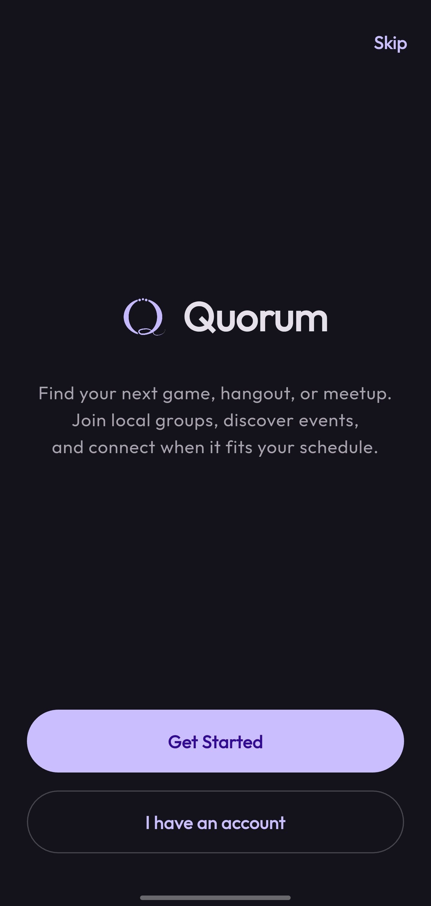
Quorum is a mobile app for finding events near you and getting people to actually show up to them: pickup games, club meetups, study sessions, anything with a time, a place, and room for more. Open it and you see a feed of what's happening nearby, with the still-open spots and the details right on each card. Tap Join, and you land in a shared chat with everyone else going. It started as “Player Needed” for pickup sports and grew into a general events app with groups, profiles, and messaging.
It was my senior capstone in Computer Science at Ohio University, built in Flutter and Firebase by a five-person team. I led the UI/UX end to end, from Figma flows to a Material 3 design system. I also took on a large share of the engineering, building much of the Flutter front end and the Firebase back end behind it.
02 · Problem
The plan only works if people show
Events run into a chicken-and-egg problem, whether it's a pickup game or a club's first meetup: the people who'd come can't find them, and the ones that need people can't find the people. The coordination that does happen scatters across group chats, stories, and word of mouth, where a half-formed plan quietly dies because nobody could tell if it was actually happening.
That gave the product its one-sentence brief: put the nearby events in one place, make the open spots obvious, and keep the people who join talking in the same app, so “we need a few more” reaches someone who can actually fill it.
03 · Role & process
From Figma flows to a shipped design system
I owned the design from the first sketches, mapping the core flows (registration, discovery, event creation, chat) as clickable prototypes in Figma before any of it hit code. Testing those flows cheaply meant we settled the hard navigation questions on the whiteboard instead of mid-build.
Those prototypes became a real design system in Flutter: a Material 3 theme with custom light and dark color schemes, an Outfit type scale, and shared components so every screen felt like one app. A ThemeController swaps light and dark at runtime. The whole UI was built against tokens, not hard-coded colors, from day one.
04 · Product decisions
The calls that shaped the app
Discovery is location-first
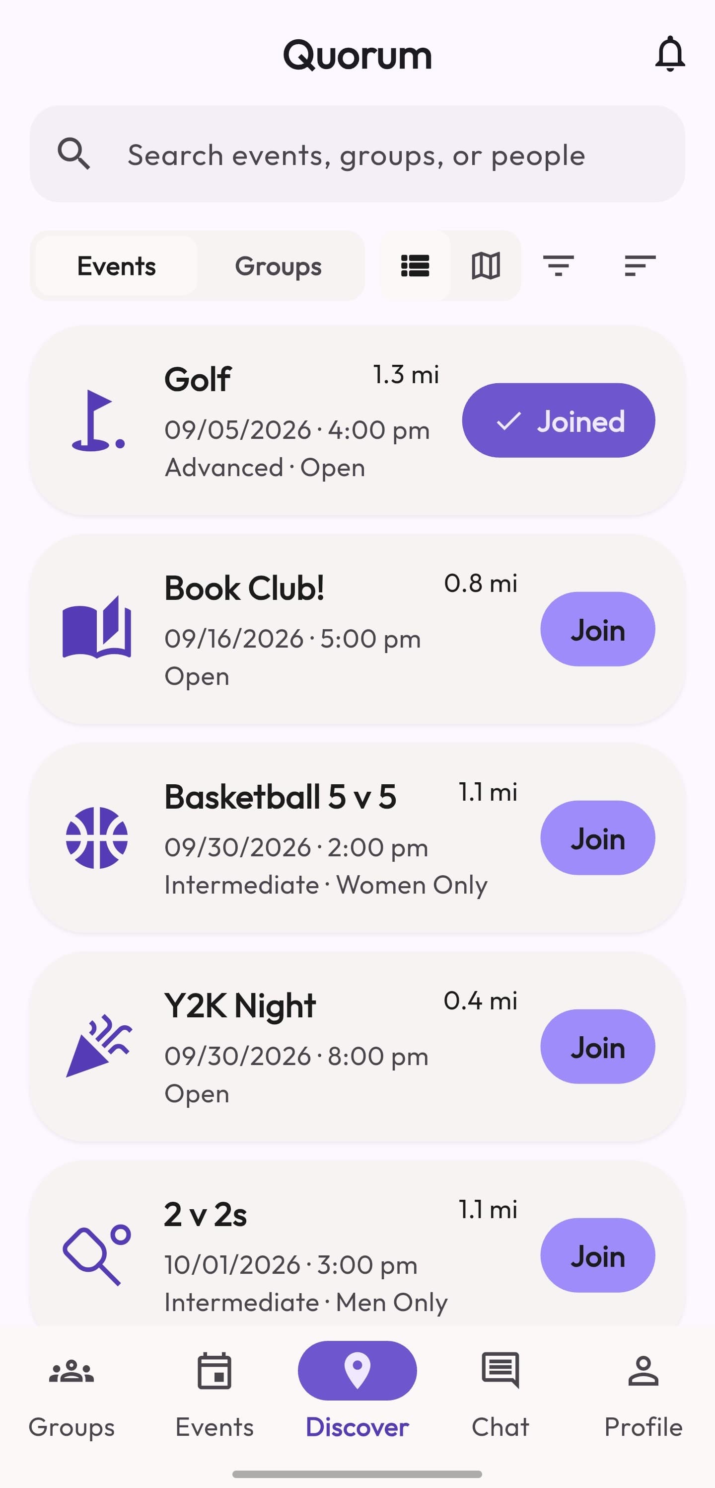
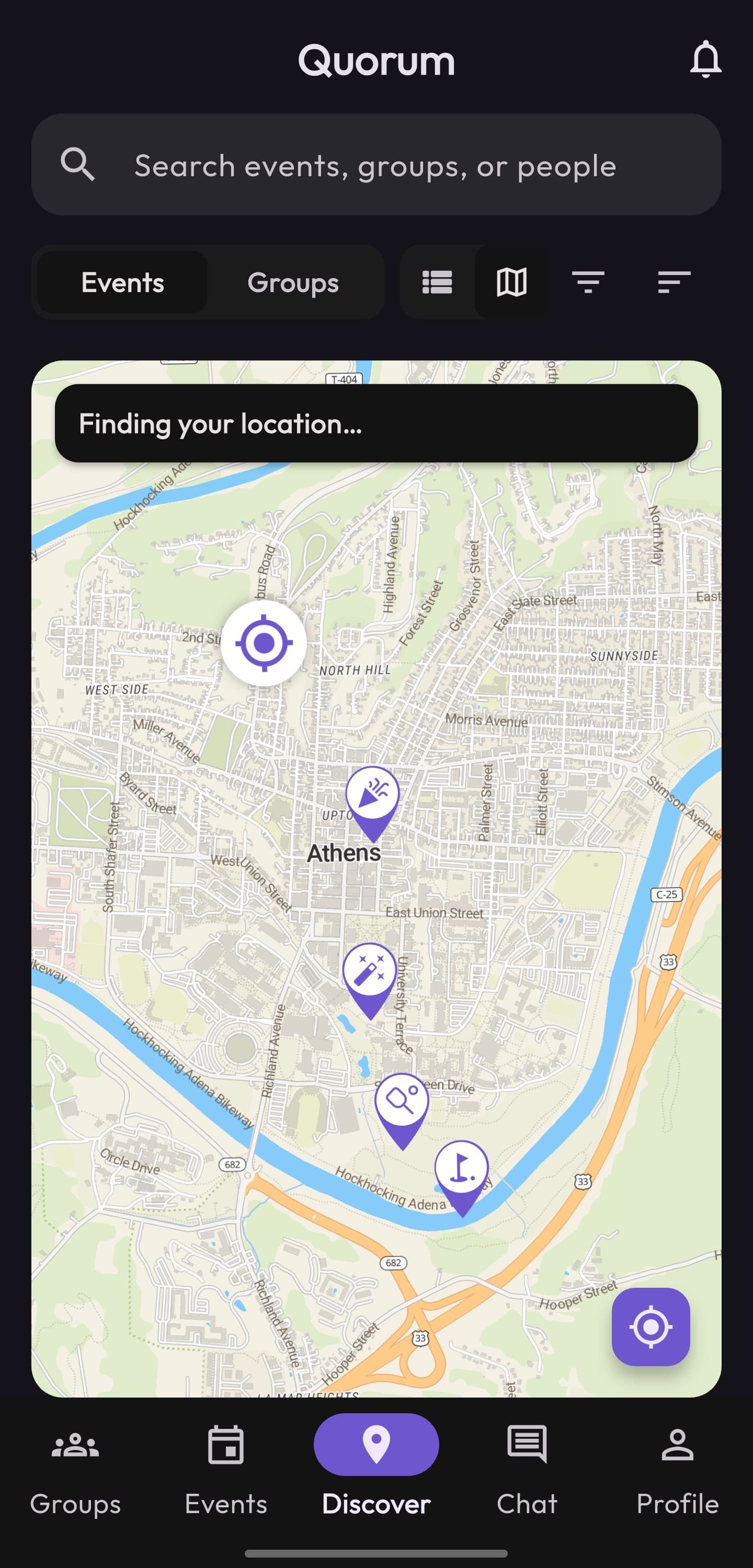
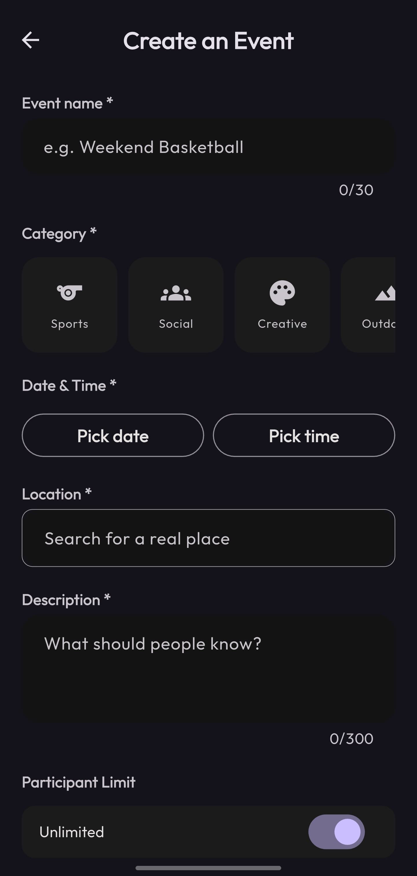
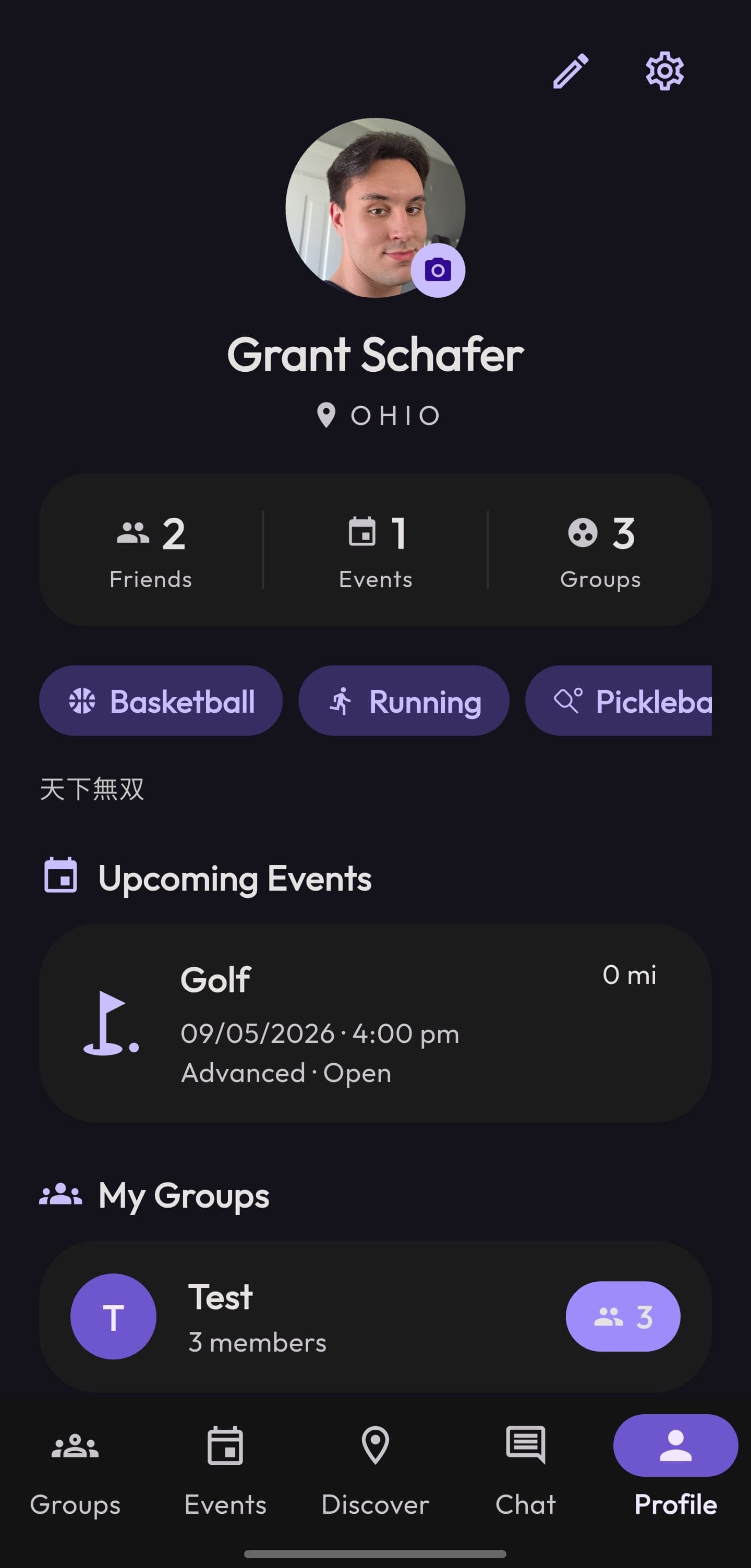
The home screen isn't a calendar. It's a feed of what's near you now, sorted by distance and time, with category chips to filter by what you're into. Events carry a real GeoPoint, so distance is computed from your actual location, and a map view plots them. Picking a place when you create an event uses Google Places autocomplete, so locations are real and consistent.
Open spots are the whole point
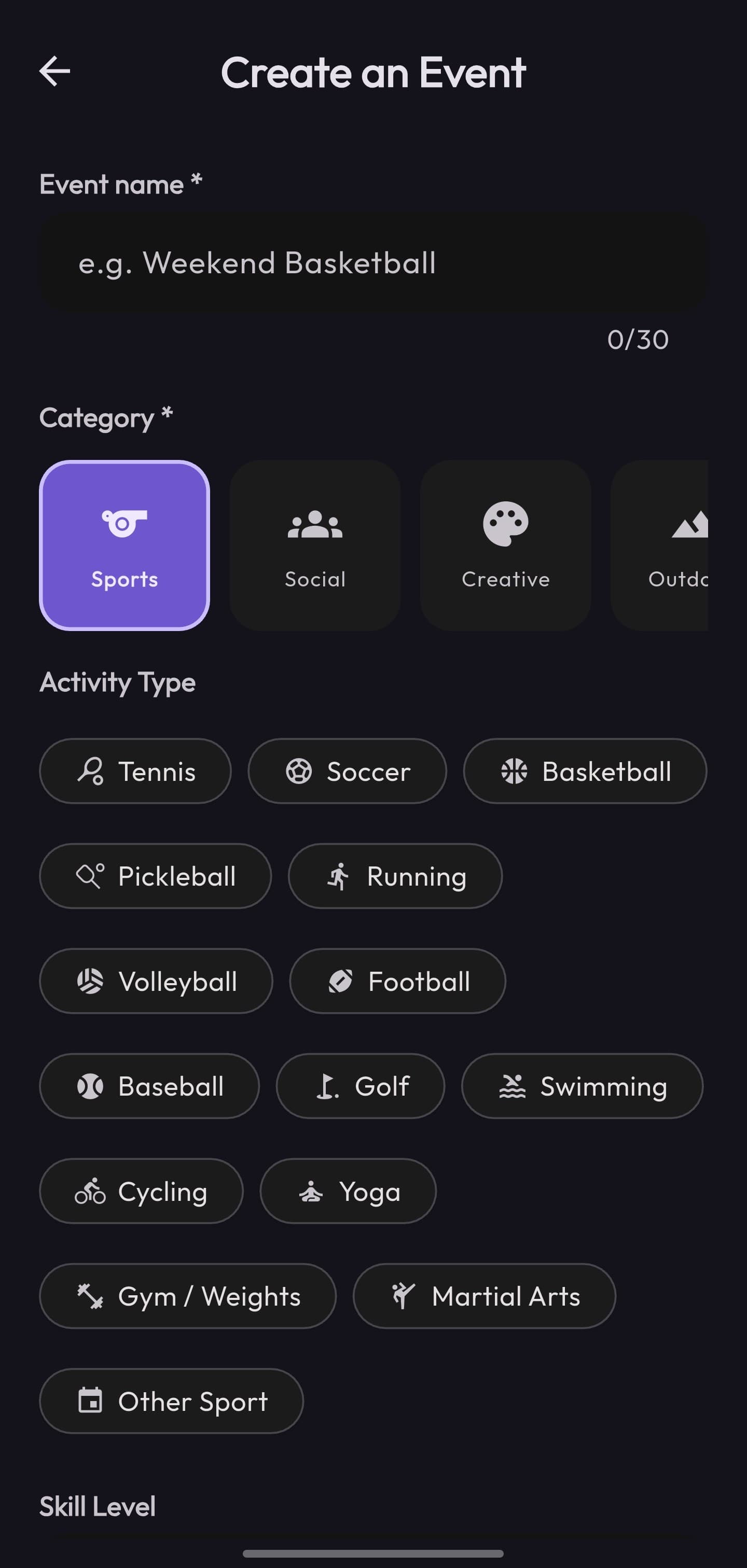
Every event tracks how many people it needs and who's already in, so a card can say “needs 2 more” at a glance. Open one and you get the full picture (who's hosting, who's coming, the exact spot on the map) behind a single Join that drops you straight into the group. For a pickup game that includes skill level and who-can-join; for other events those fields just fall away.

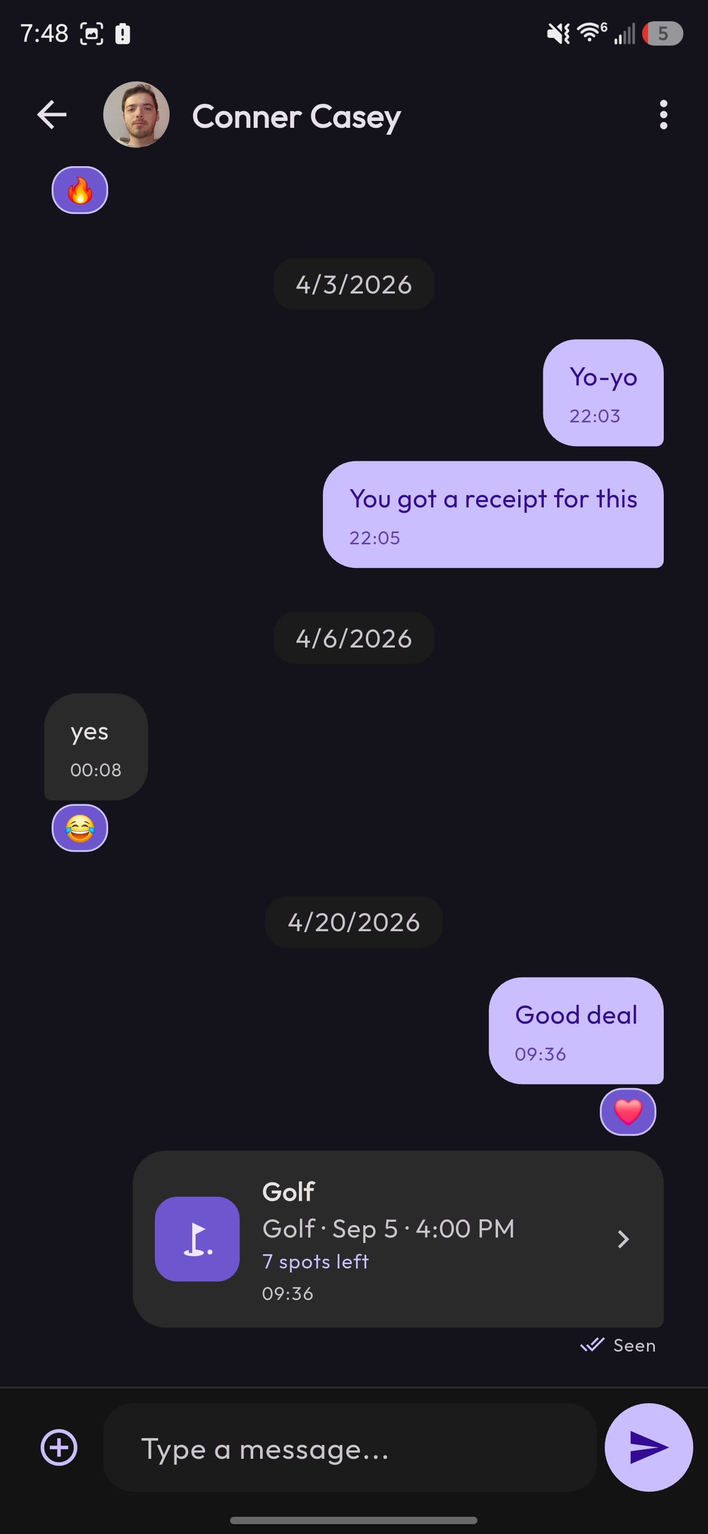
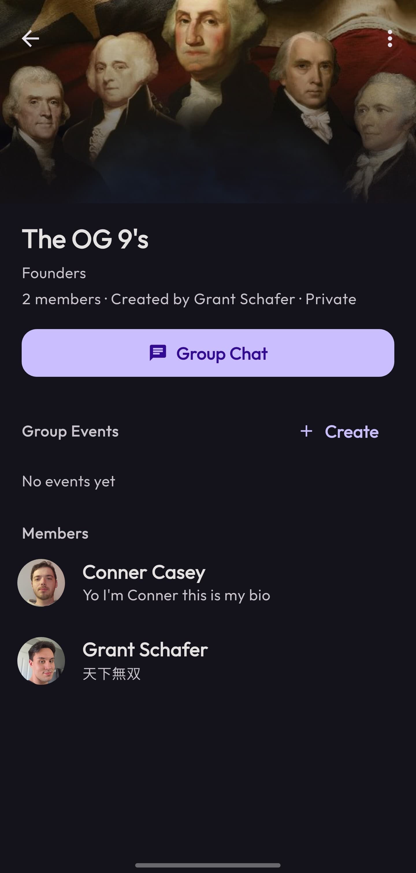
Coordination lives in the app
Joining an event drops you straight into its group chat, so plans don't scatter back out to a dozen separate threads. The chat is a full real-time system: direct and group conversations, read receipts, emoji reactions, photo sharing, and the ability to share an event as a rich card right in the conversation.
Light and dark, by design
Both themes were designed together, not bolted on. Custom Material color schemes, a consistent type scale, and tabular figures for the numbers that matter (distances, counts) keep the app legible and calm in either mode. The two Discover screens at the top are the same screen, same code, different theme.
More of the app
05 · Engineering
Flutter + Firebase, and the hard parts
The back end is Firebase (Auth, Firestore, Storage, and Cloud Messaging), with a feature-first Flutter architecture that splits each feature into its data layer and its UI. I designed the Firestore data model: collections for users, events, groups, chat rooms and their messages, plus per-user notifications, all driven by realtime listeners so the UI updates the instant data changes.
The interesting problems were the ones you don't see:
- Joining can't oversell an event. Limited-spot events use Firestore transactions to add or remove a person, so two people tapping Join at once can't both claim the last slot.
- Derived state stays in sync. An event's group chat is kept in lockstep with who's actually joined: membership changes sync to the chat room automatically, and participant names are denormalized in so the list renders without extra reads.
- Unread, done cheaply. Read state comes from per-user timestamp maps; marking a thread read batches its updates and caps the work to recent messages, so opening a busy chat doesn't fan out into hundreds of writes.
- The feed stays fresh. Events that are past get archived to a separate collection, so Discover only ever queries what's still worth showing.
06 · Outcome
What shipped, and what I took from it
5
Person capstone team I shared the build with
Android
Shipped from a single Flutter codebase
2 semesters
From first Figma flow to a working app
Quorum is the project where design and engineering stopped being two jobs for me. Owning both meant the Figma decisions and the Firestore decisions answered to the same goal, and the up-front design work (the flows, the prototypes, the design system) is exactly what let the build move fast, because the structure was settled before the code started. That's how I want to keep working: understand the problem, design the solution, then build the whole thing, front end and back, to match.